July 12th, 2024
How to Use Excel for Statistical Analysis
By Connor Martin · 14 min read

No matter the field, no matter the career, everyone’s heard of Microsoft’s spreadsheet program Excel. It’s both a household name and software with countless uses. It’s also a very powerful tool for analyzing data sets, making it an indispensable companion for any statistician. If you’ve got the raw data, Excel has a way to make sense of it all, from analysis to visualization.
Be it organizing, recording, or manipulating data, there are functions for every task and purpose. This article will be a general guide to using Excel and statistical analysis to its fullest.
Understanding the Basics of Statistical Analysis
Data analysis uses large amounts of data to try and make sense of complex subjects. In order to do that, you’ll need to gather as much information as possible, then use statistical tools and processes to organize it, and identify or interpret what patterns and trends emerge.
It’s all about finding correlations between independent and dependent variables and using these insights to decide on proper courses of action. In the professional world, statistical analysis is used to mitigate risk, address broad social issues, build predictive models, and much more.
There are two types of statistical analysis:
- Descriptive statistics – This statistical analysis prioritizes the organization and presentation of data (often through visualization) without interpretation and drawing conclusions.
- Inferential statistics – As the name implies, this analysis uses the data gathered to infer meaning and provide an effective response. It relies on variable correlation coefficients and identifying underlying trends.
The effectiveness of data analysis heavily relies on:
- A strong hypothesis to ground the process.
- The quantity and quality of data gathered.
- The interpretation methods that are used to parse it.
- The software or data analysis tools used to get the job done.
How Excel Can Help with Statistical Analysis
Handling such large amounts of data and rapidly running multiple variables through numerous organization methods and formulae is a task that would take someone a long time to complete using conventional methods. Powerful software, be it machine learning tools like Julius AI or stalwart software like Excel, is vital to faster calculations.
Excel provides a user-friendly approach to data analysis, along with hundreds of pre-defined statistical functions and data visualization tools to help you organize data effectively and present it in readable ways. It allows for data to easily be accessed from multiple sources (text files, spreadsheets, word documents) and converted into multiple formats (time, currency, decimal values).
Being one of the most popular analysis tools in the world, Excel also has countless online forums and resources to help users find their feet and provide whatever support they need.
Statistical Analysis Methods in Excel
In addition to standard calculation and data sorting techniques, there are many methods in Excel to make statistical analysis that much easier.
For sorting datasets:
- Ranges and tables – Excel offers versatility in its data input methods and your variables can be inserted in range or tabular format. That said, the format you use will influence what functions you can use and how successful the overall analysis is.
- Data cleaning – You only have to comb through and clean your data once to realize you need to find a better way. Excel automates this process by allowing you to choose formats for your values, be they time, currency, or dates.
- Sorting and filtering – It’s not just about arranging your column data in ascending or descending order with Excel. The software allows you to arrange data in a custom way, even randomly. Filters also help highlight data that meets the criteria, making your job easier with large data sets.
- Conditional formatting – Excel takes cleaning and sorting one step further by allowing you to highlight data according to the predetermined criteria you pick out for it. This allows for quicker sorting and highlights the values you need in an instant.
- Pivot tables – Probably the most popular reason for using Excel for statistical analysis is its use of the pivot table. The software easily allows you to summarize swathes of data and extract specific data from it in a variety of ways, be it filtering, sorting, or even changing the summary calculation.
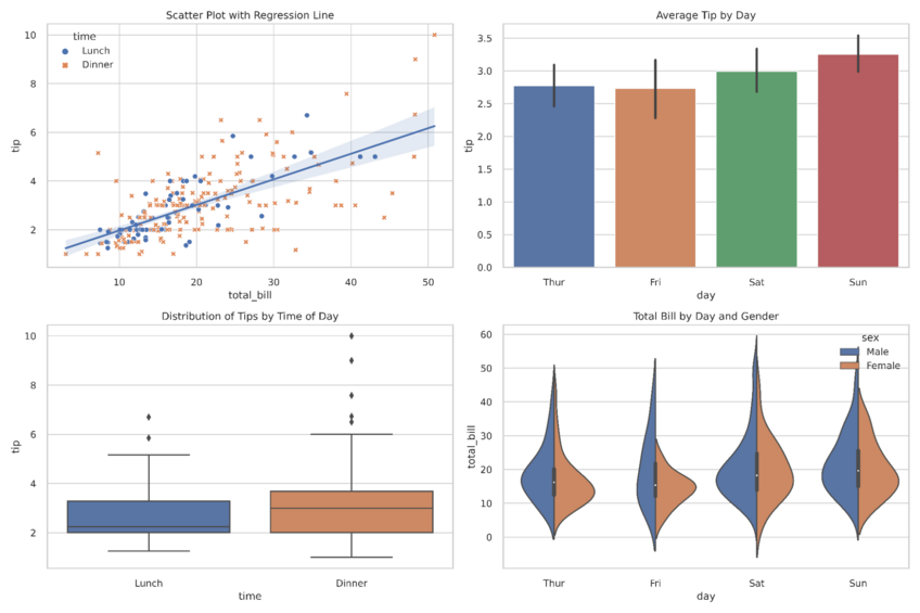
- Data visualization – It’s easier to understand the big picture when it’s presented graphically. From your simple pie chart to more complex scatter plots, Excel provides multiple ways to present your data sets and even more ways to customize them.
- Data validation – Everybody hates the dreaded error messages after inputting a function. This can often happen due to invalid data sneaking into sets. Excel allows users to establish validation values for cells, and the option to exclude erroneous values from any calculation or analysis.
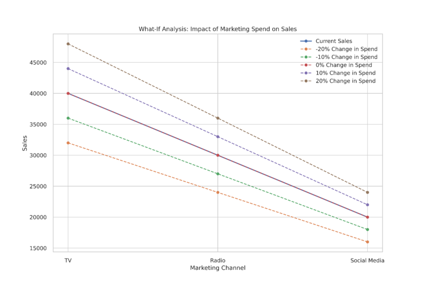
- What-if analysis – Within a pivot table, you may want to see what impact certain cell changes may have on the overall result. These conditions are much easier to do thanks to this handy feature.

Excel Formulas to Know for Statistical Analysis
So, if you’re using Excel for much of your data analysis work, there are certain core functions you’ll be returning to time and time again. It never hurts to familiarize yourself with their formulae.
- AVERAGE – Calculate the mean of a set of numbers
- VAR.P and VAR.S – The variance of population or sample data
- STDEV.P and STDEV.S – Calculates the standard deviation of a population and sample range
Some functions for relative standing include:
- RANK.EQ and RANK.AVG – Ranks numbers within their set, returning the top rank or average of repeating numbers
- PERCENTILE.INC and PERCENTILE.EXC – Ranks numbers within their set as percentiles
- QUARTILE.INC and QUARTILE.EXC – Ranks numbers into quartiles in their set according to value
For correlation and regression analysis, there are:
- CORREL – The correlation between data sets
- RSQ – The determination coefficient between data sets
- STEYX – Calculates the standard error of estimate for the regression line between sets
Finally, some array functions for figuring out sets of values:
- FREQUENCY – The frequency of certain values in a set
- LINEST and LOGEST – The regression statistics between multiple sets, based on their linear and curvilinear regression respectively
- TREND and GROWTH – Places values in a linear or curvilinear trend according to their known data points
Pros and Cons of Excel for Statistical Analysis
Excel, like any other software, is just a tool and comes with its own set of benefits and limitations.
Pros
Some benefits of using Excel for statistical analysis include:
- Support – Excel is widely used the world over, and if you’re having problems, odds are there’s some resource online to help.
- Data Analysis Toolpak – Excel offers advanced functions for data analysis with an additional free add-in – the analysis toolpak – to allow for more complex modeling.
- Cost – Compared to other statistical software, Excel comes bundled with Microsoft Office and requires no additional licensing fees.
- Versatility – Excel allows for multiple ways to input and analyze a wide variety of different data, in addition to regular spreadsheet functionality.
Cons
Conversely, here are some of the drawbacks:
- Size and performance – Unlike powerful tools, statistical data analysis software, and machine learning tools like Julius AI, Excel’s performance capabilities are limited by smaller PCs and can handle only limited data sizes. Beyond a million values, calculations become slow.
- Learning curve – Many of the functions and features of Excel data analysis are not intuitive. Unlike AI tools, where chat boxes can be used, users must learn the formulae and capabilities of Excel in order to get the results they need.
- Limited automation – Although Excel’s data input is automatic, it’s limited in its functionality and prone to error. It lacks the power of more dedicated statistical tools to ensure data is effectively inputted.
- No audit trails – Tracking changes in data is vital for addressing errors and validating analysis. Excel’s lack of an audit feature makes it very hard to troubleshoot problems.

Cut Your Analysis Time in Half by Using Julius AI Instead of Excel
Excel is a perfectly capable program for statistical analysis, but its overall lack of power, steep learning curve, and lack of automation make it a challenge for frequent statistical use. The power and specialization of Julius AI are much better suited to analyze data.
Not only can it handle large swathes of data and descriptive statistics in a differing format, but provides advanced analysis and easy visualization that’s easy to share and export. To top it all off, it does this without the need for memorizing advanced functions or formulae. Make Julius AI the right partner for your job.
Frequently Asked Questions (FAQs)
Why is the analysis of statistical evidence important?
The analysis of statistical evidence is crucial because it transforms raw data into meaningful insights, enabling researchers to identify patterns, test hypotheses, and draw informed conclusions. It ensures that decisions and findings are based on reliable data rather than assumptions or guesswork.
Why is statistical significance important in research analysis?
Statistical significance indicates whether the results of a study are likely due to a real effect rather than random chance. It helps researchers validate their findings, ensuring credibility and reliability in their conclusions, which is essential for making data-driven decisions.
What is the importance of statistical analysis in educational research?
Statistical analysis in educational research helps evaluate teaching methods, learning outcomes, and institutional performance by identifying trends and patterns in student data. It provides educators and policymakers with actionable insights to improve educational practices and policies based on evidence.
